
The service and design delivery process is similar to the double diamond approach to innovation. In alpha, we continue from discovery, covering the first part of the second diamond. My interpretation encompasses the following steps.
Making it easy to understand where every student is at
Product Design

Role
Lead UX Designer, ESA
UX Strategy, ideation, interaction design, prototyping, UI design, mentoring/direction and reporting
Duration: 6 months
Team
2 Business Analysts
2 UX Designers
2 Front-End Developers
1 Stakeholder Manager/SME
External user research team
Project
Online Formative Assessment Initiative
Client: Department of Education
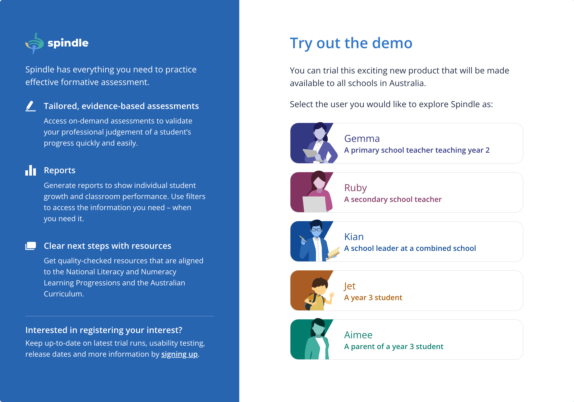
End-users: Teachers, school leaders, students and parents
It's solution time
The design and development team and ESA was tasked with taking the findings and recom on from the user research phase (discovery) to the design phase (alpha) of the Australian Government's Service design and delivery process. In summary, the team was to design what does an online on-demand assessment tool look like that answers gaps in the current landscape of supporting student progress.
My role as the Lead UX Designer was to oversee the entire end-to-end design and ensure it met the needs of users with a thorough validation of the team's outputs and ensuring they are delivered on time. I also produced outputs to ensure we met out deadline, particularly in the early stages for developing user flow and innovation.
Key design challenges
We had two key challenges to address from the research phase.
One-stop shop for formative assessment needs
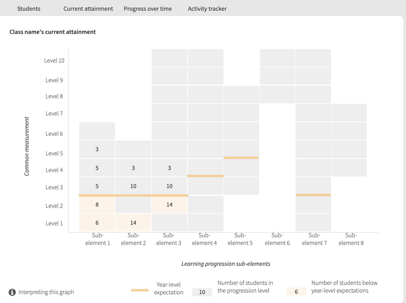
It was clear during our past user research teachers were already a lot of amazing tools out there, but they were everywhere. As the spread of differences between each student grew, teachers needed to adapt to a larger range of abilities in the same classroom, meaning more tools and resources - and sometimes experimentation. Having a platform that collates and curates quality tools would save them time and worry that they are helping students effectively and efficiently.Easy-to-use yet meaningful collated data visualisations
The biggest pain point that we uncovered was the enormous amount of data being produced by these tools, and the time it took to collate them and align them to a learning framework such as the curriculum or learning progressions. Collating the data took time away from attention they could give to students instead, and it took even more time to wrangle the data into insights. Automating this process via integration would reduce this overhead and allow teachers to focus on teaching.
Other challenges
Scale: The hypotheses from the research phase contained 485 features to be tested, and for four different user types. This would involve a large amount of screens to design, prototype, test and iterate within 6 months.
Multiple levels of governance in a short deadline: There was even more stakeholders involved in the design phase than the pervious phase, however it was a concentrated to certain areas of design such as branding workshops and usability testing. As I was involved in discovery, my stakeholders trusted me to create usability testing tasks independently and lead the team consistently to what they experienced during the previous phase.
Saturation: Although we already had personas and the majority of the team had been involved in the user research, our key stakeholders gave the directive to ensure we included more people in this next phase of validating the solution through moderated usability testing exclusively.
Design process
The design process I was required to follow for this project was the DTA service design and delivery process, based on the double diamond approach. My team is agile however, and we follow the design thinking process within this double diamond approach, usually at one-week intervals to fit within the timeline. Outputs were run by the stakeholder manager, with key outputs including IA, wireframes, UI design + style guide, prototype and MVP story map requiring approval with stakeholders. Iterations were often run in parallel to meet deadlines.
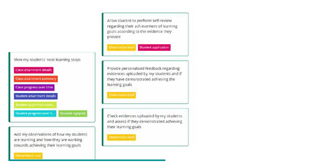
User stories
Based on the research conducted in the previous phase, I chose the most prominent pain points from discovery and created six user stories with proof-of-concepts to showcase an ideal solution to solve the pain point. The concepts were created using Adobe XD, and collaboratively developed with business analysts using Miro.
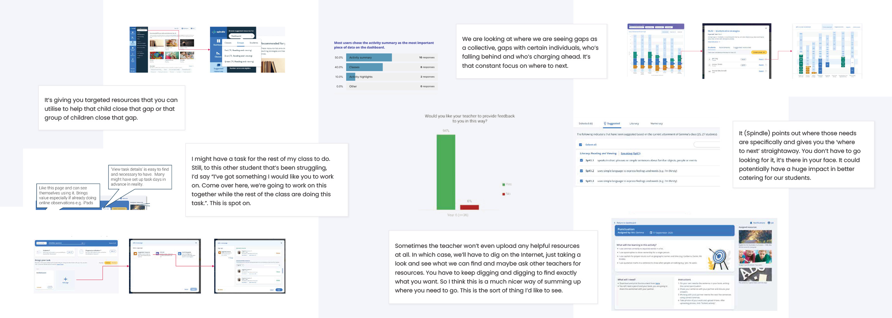
I conducted a workshop with around 40 teachers and school leaders across Australia where they interacted with the concepts through a gallery walk, and provided feedback by attaching sticky notes to each concept. This feedback helped me in my next step of ideation: developing the user flow.
User flow
As part of my process for designing the user flow, I undertook three different activities: IA, user flow mapping and wireframes. Having all three allows me to keep the overall flow in mind and many different pathways a user can take whilst working on each page layout.
IA (Information Architecture)
The initial IA I created in Miro was simply based on separating each user story into its own category, as they were done during different steps. Doing it this way aligned the IA to the user's journey, they will come to the platform to do different things and look for different content at different times. This would also make it easy to test later by focusing on one area at a time.
As I gathered more information from stakeholders, the IA was adapted. Only the professional learning area changed as I learned more about the content of the area.
User flow diagrams
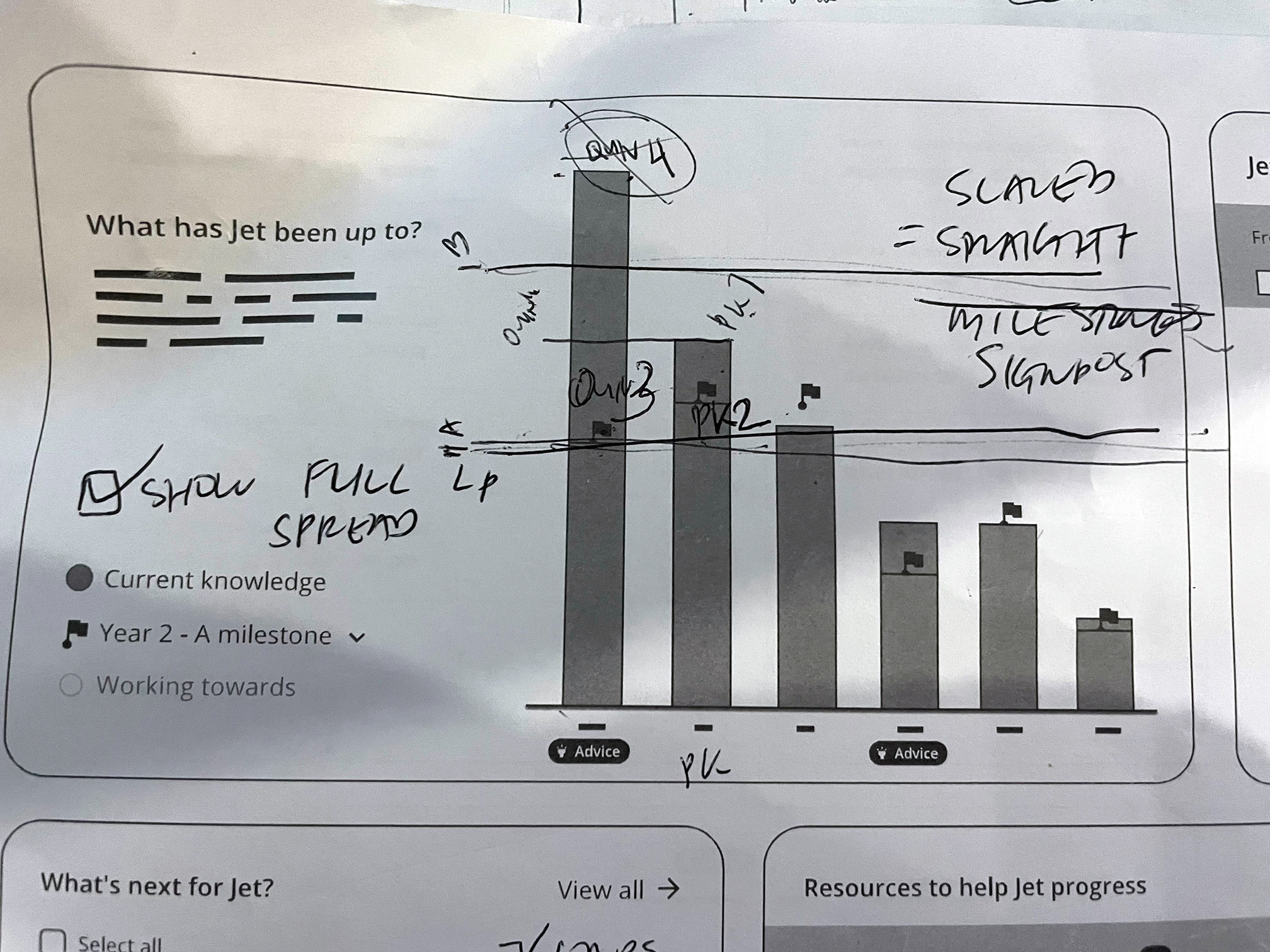
The user flow diagrams go further than the IA, and show specific pathways through the system. It helps me see the main pathways a user will take to fulfil their goal, as well as other common pathways, helping me prioritise which flows we need to focus on, as well as those that needs to be flexible, such as the reports area.
Wireframes
Wireframes help me focus on the core user experience without the distraction of UI.
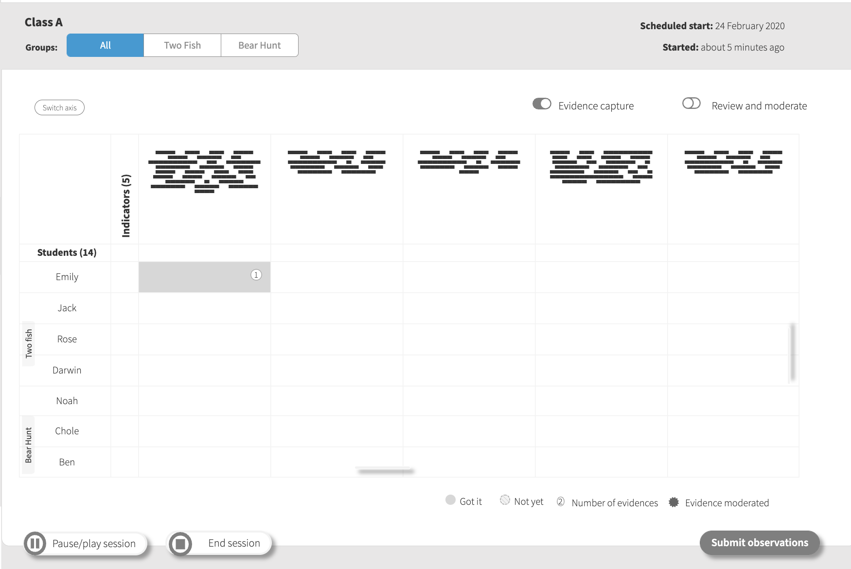
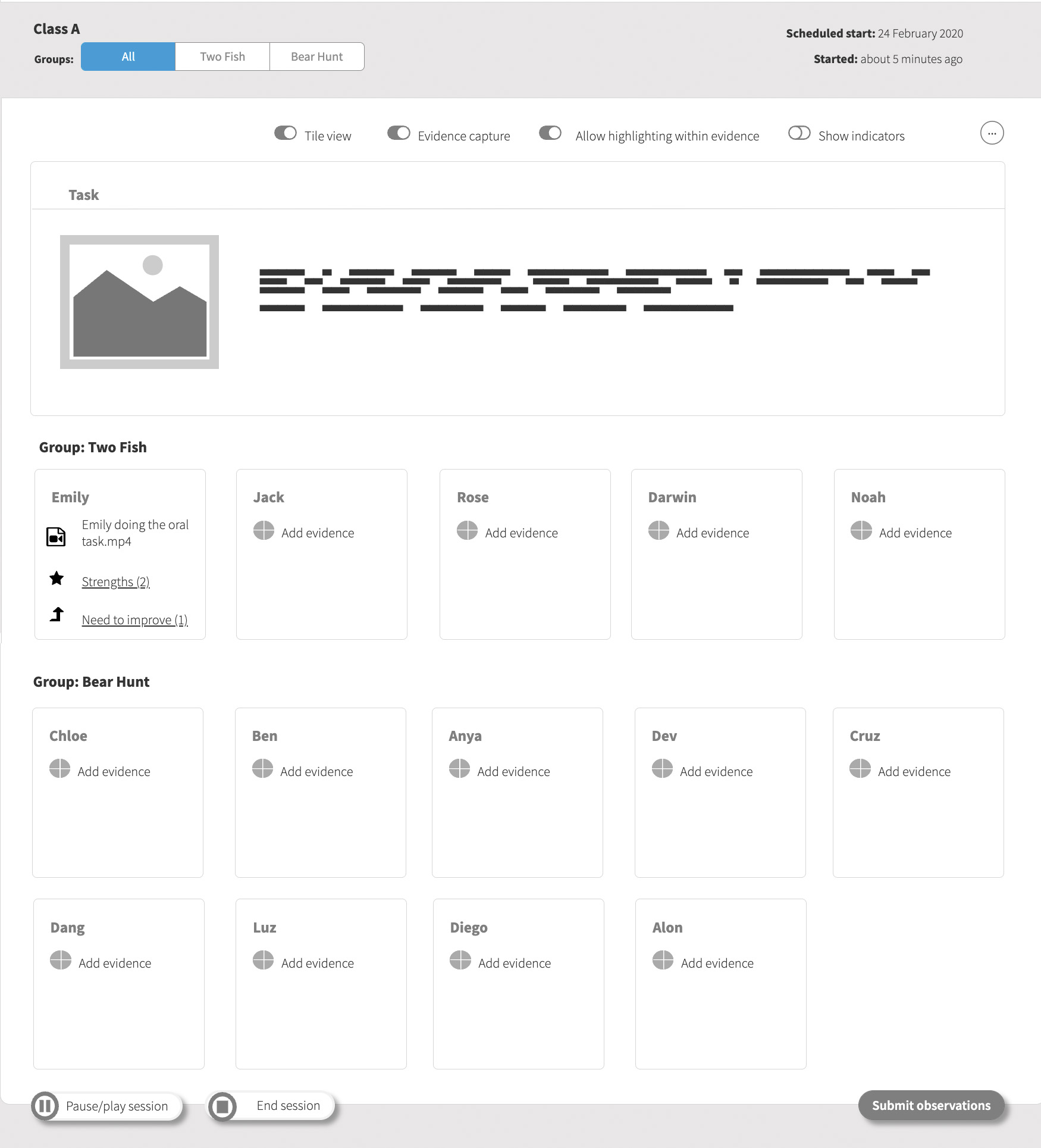
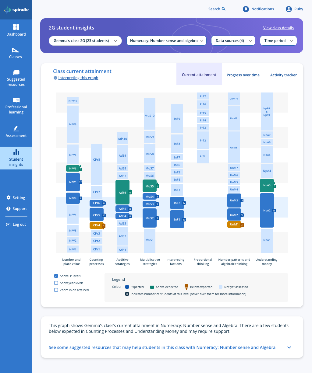
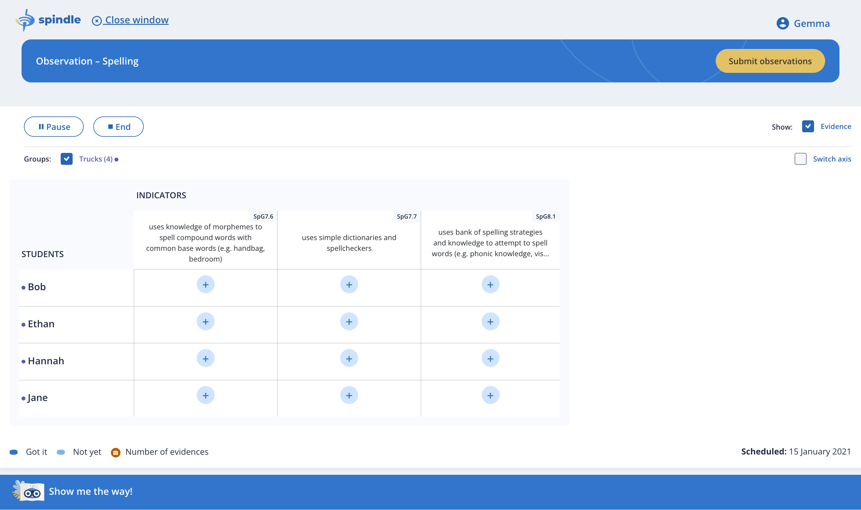
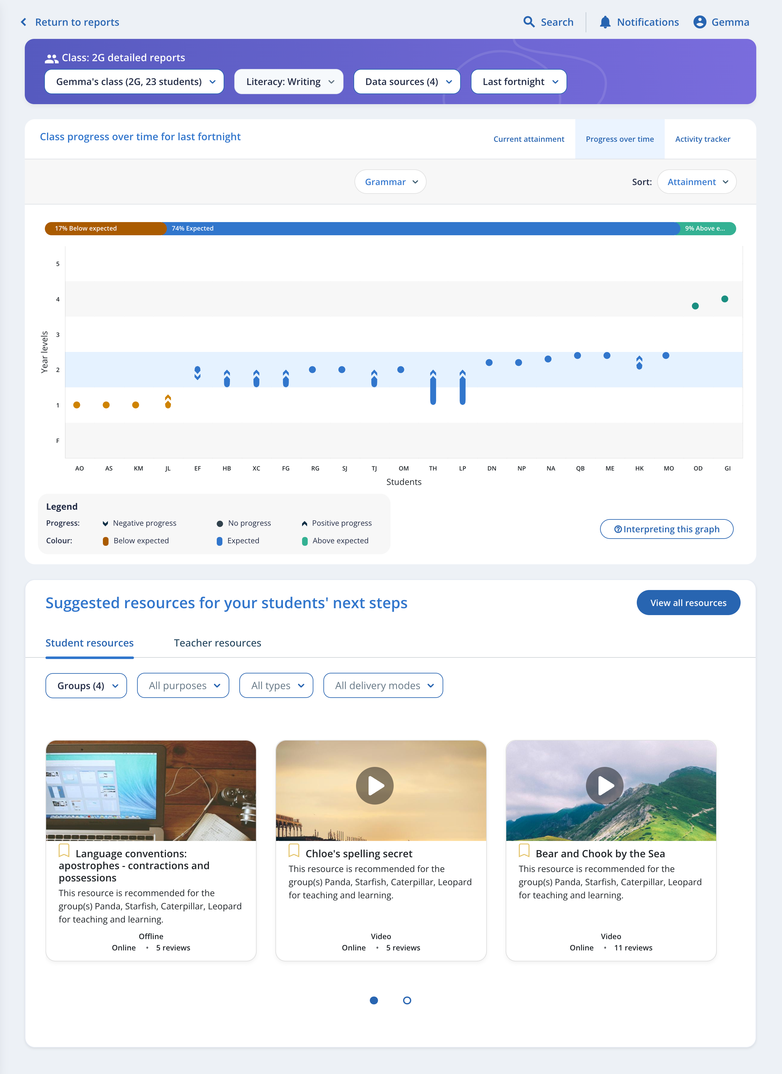
Working with the business analyst, I started with the most important feature and end goal of the experience on the platform, collated data visualisations incorporating multiple data sets. Different data visualisations were studied and analysed, as well as how early these visualisations needed to be introduced into the experience (eg. during data collection itself). This involved:
Paper testing with data analysts,
Experimenting with devices such as ipads and
Consulting with a subject matter expert on usage in classrooms.
Early validation via A/B usability testing
In one area where stakeholders could not decide between a certain bias in how users would use the content, usability testing was completed to ensure an objective user-centred decision. Remote A/B usability testing was conducted by creating an interactive low-fi prototype made with Axure and Loop11 using a discussion guide created by a business analyst and myself. Users were provided with two different flows during the usability testing. Option A tested higher on confidence and success rate, giving stakeholders confidence in the decision. This was also my preferred solution, as it was close to what teachers were already doing on paper so would not require much change management.
-
Option A
-
Option B
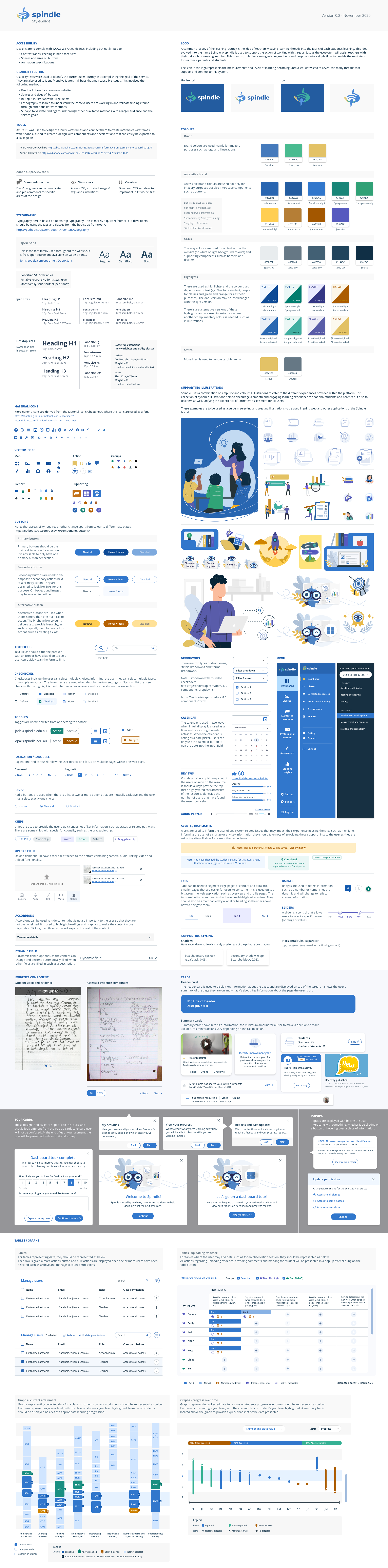
UI Design + style guide
After the branding guide and wireframes were approved by stakeholders, UI design began to prepare for the high-fidelity prototype. I mainly directed the design and vision for another UX designer, although I did jump in to design some screens myself as the requirement specified two alternatives needed to be provided, and all major screens included.
It was my job to ensure:
Validation with key stakeholders and wireframes
Alignment to the branding guide I had developed
Two options were provided as per the assigned deliverables
Style guide contained all necessary materials, components and patterns to allow new designers to develop new features consistently
Compliance to WCAG 2.1 AA
Technical feasibility
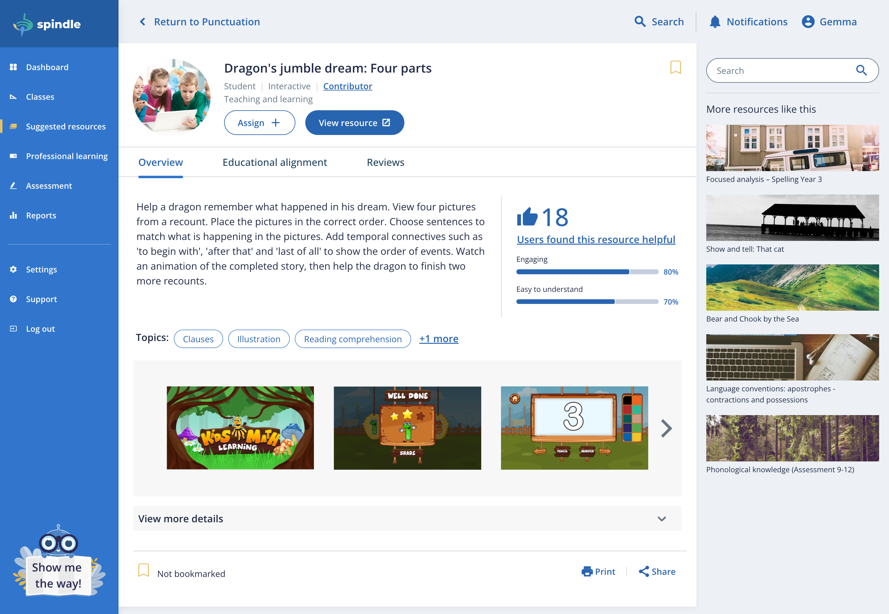
Screens were mocked up in Adobe XD to provide design concepts for each user type (teachers, school leaders, students and parents). The data visualisations in particular were developed in partnership with stakeholders to ensure they provide accurate insight.

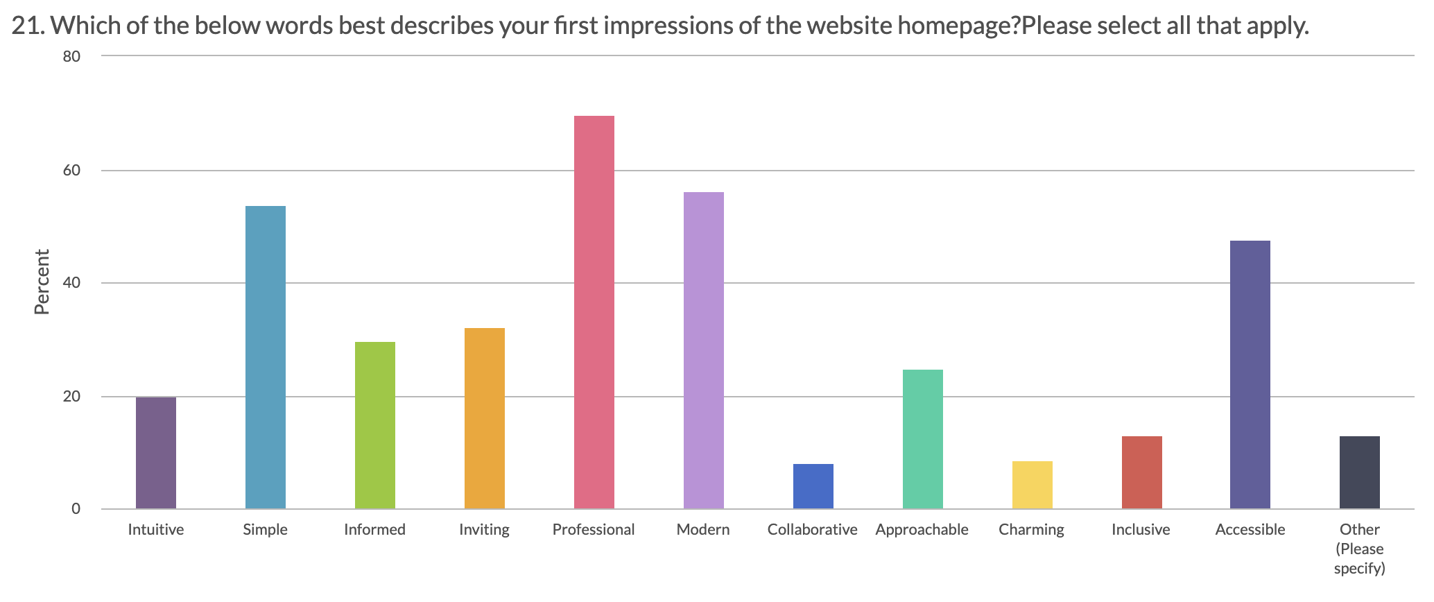
Early validation of the design via survey
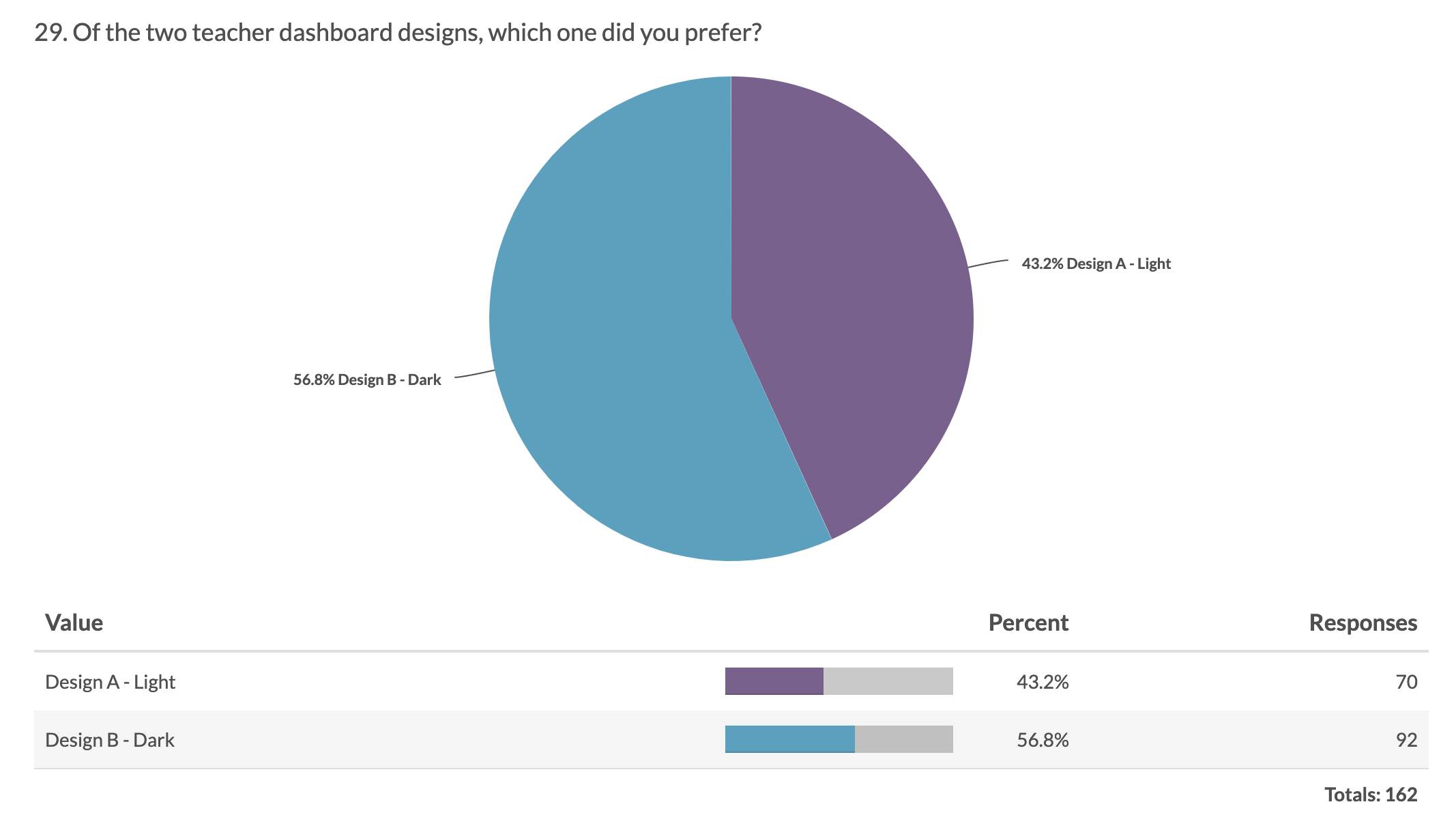
During the A/B test, 300 teachers, school leaders, parents and students were asked how well they felt the design aligned with the brand attributes, as well as their own personal preference and understanding of language and layout via an Alchemer survey. Design A scored higher than B in terms of appealing visuals, however B scored higher in layout. The final result was a combination of the two.
-
Surveys contain questions around the user's feelings (as above), as well as questions discussing colour, layout and content
-
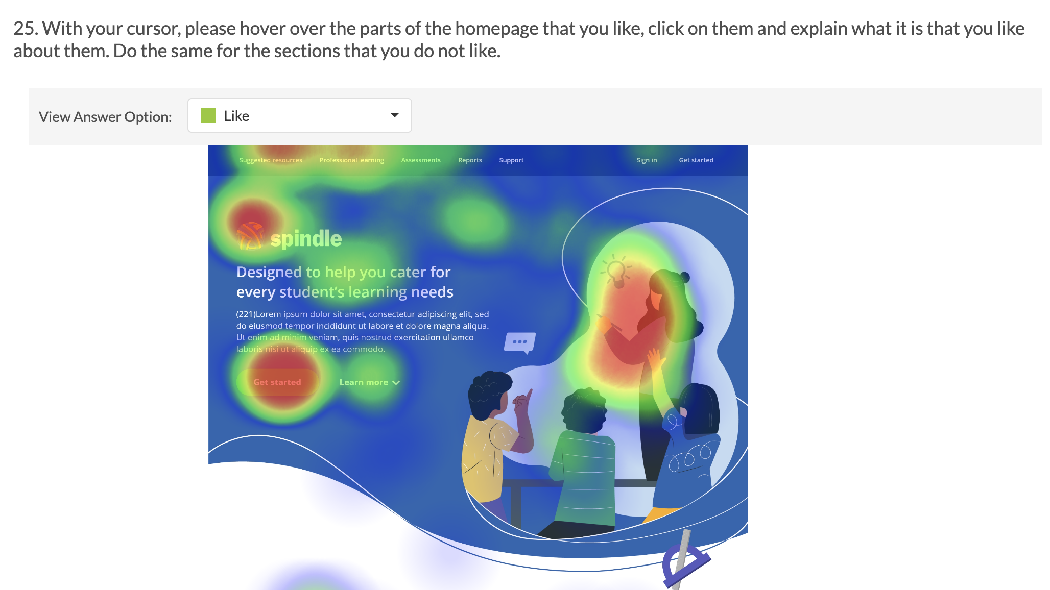
Hotspot analysis is a common technique I use to get qualitative feedback on designs
-
Validating the branding guide and design objectively via user's first perception

Highlight: Athena, our mascot
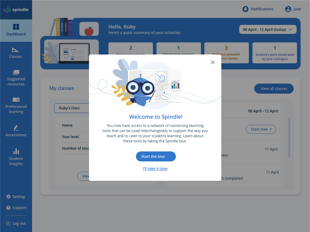
One of our key stakeholders was especially fond of the name Athena for the platform, but it did not validate well with the target users. However, I tasked the UI designer to include her in the form of a mascot instead for the design. She became a point of call in the application, providing tours and context for users.
High-fidelity prototype
A HTML prototype was created based on the functionality in the user flow diagrams and wireframes, as well as the design presented in the style guide.
As part of the DTA process, the prototype to test for a minimum viable product must look and feel like the real thing, hence the best way to do this is use similar techniques in developing the actual tool itself: HTML, CSS and Javascript. To quickly develop the prototype, we adopted the Angular framework, as well as Google Sheets CMS to us to make updates to the prototype quickly when presenting to different stakeholders. All user type flows were implemented, even storing some session data in the user's browser to test capturing evidence using camera.
Although the work was quite substantial compared to your normal prototype, our team was still able to pull it off to a strict 8-week deadline via an agile process and involving QA. The prototype works well in conjuction with the style guide as a baseline for developers in future development stages.
Usability testing
I developed a discussion guide with a business analyst to test the happy path and find what were the essential features the tool required to be useful for enabling student progress and what were the nice-to-haves. This discussion guide was then provided to the user research team after it was approved by stakeholders, and they then executed a research plan that involved the following methods:
Remote moderated usability testing
Remote unmoderated usability testing
On-site moderated ethnography testing
Surveys
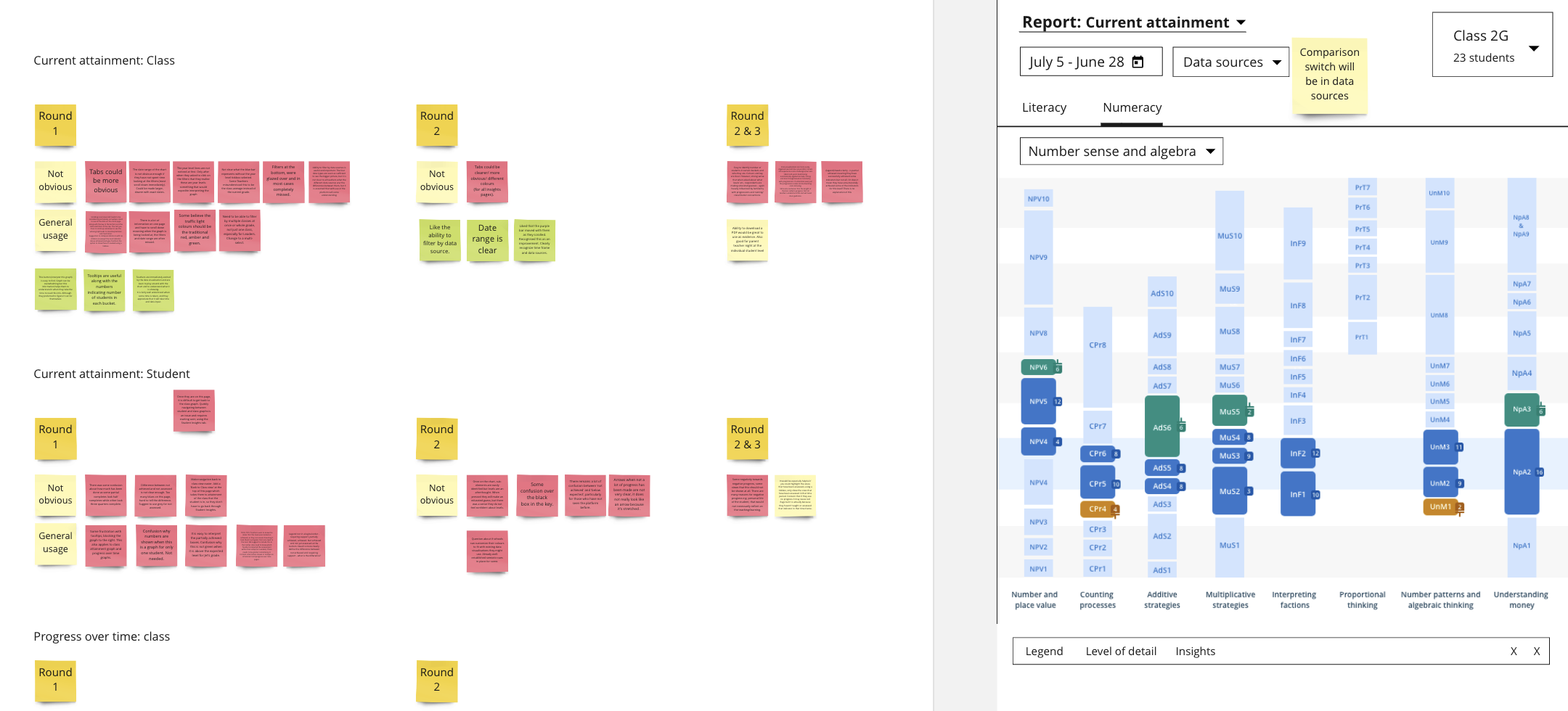
Three rounds were held including each method of testing, where we reached 368 users. After each round, features were refined, added and removed, forming the outline of a minimum viable product. I worked with another UX designer and two business analysts to analyse the data being collected via Miro and Dovetail.
The challenge of the Coronavirus (COVID-19) pandemic
Although the majority of our stakeholder management was affected during the pandemic, it was especially affected during usability testing. Teachers, school leaders, students and parents were adjusting to remote learning, and we did not want to add another burden to our participants. So we held three rounds of usability testing to suit their circumstances, and everything was held remotely, including workshops. Only on-site ethnography testing was allowed in schools that were business as usual during the latter part of 2020, such as New South Wales.

Stop and think!
It was important, especially between iterations of the prototype and usability testing, to sit still and reflect on the work and feedback we have been doing up to a point so we do not get stuck on the same ideas, reduce bias and ensure we are always listening to our users. We had strict deadlines where we were working on one-week sprints to ensure a high quality prototype.
I took initiative to lead a one-day workshop between the developers and designers, beginning with a deep dive into the research and background in the morning, and in the afternoon to pair program/design and collaborate to understand each other's responsibilities in greater detail by giving it a go.
The developers also got a chance to attend a usability testing and observe the process, and we shared experiences during our daily stand-up, providing them inspiration on solving problems in different ways - from the user's perspective.

Defining the MVP
Finally the team had developed a tool that has been through a great deal of testing and iteration to help us see what a minimum viable product (MVP) that will support student progress looked like. I worked with the UX designer and two business analysts to create a story map based on the features in the prototype using Miro.
I worked with the business analysts to present the external stakeholder team through a workshop where we prioritised the stories according to the stakeholder's objectives and capabilities to define a feasible MVP. Anything below the line became a future opportunity that could be explored as a new feature to test once the tool has been live and user's needs may have evolved.
Story-mapping
Story-mapping is a technique I use to envisage a product or a service as a series of tasks that a user completes. Each feature is then mapped to the user journey. Afterwards, the team works together to rank features by user value or necessity, ranging from the highest necessity features at the top of the list to the lowest at the bottom through online sticker voting via Miro.
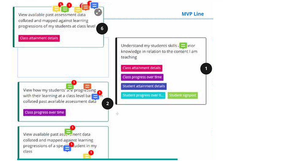
MVP workshop
A workshop was held with key stakeholders to discuss and collectively agree on which set of proposed features would be MVP. Based on discussions around what can be achieved within the assumed project development time and other contstraints, stories were moved above or below the MVP line during the meeting via Miro.
Report
A final report was written by myself with the team to outline the design and functionality for a minimum viable product to support student progress, again using Miro and imported into Adobe InDesign. It is a public document that can be viewed at the Online Formative Assessment Initiative. I presented a Powerpoint summary during the last workshop with our end-user reference group and stakeholders.
Conclusion
The design was well received by end users and majority did agree it would alleviate their issues around data collation and analysis. However, the onboarding was still a necessary step since many teachers did not process their observations, and other asessments, digitally - it would require some investment for them to get used to a new system.
The reporting dashboard was the highlight for every teacher as it was unique in that it produced a report from multiple sources of data, and most were able to grasp it straight away. Many teachers are looking forward to using it for their work during a beta phase, where hopefully the real test will finally be in place to see if it improves student progress by analysing student outcomes.
Our stakeholders were happy with the final outcome, everything was delivered as per schedule and all feedback was considered and analysed. The initiative is still active, and currently pursuing a development phase.
Lessons learned
The process we followed for alpha was very different to discovery, as it was disturbed by the COVID-19 pandemic. We had to adjust our workshops and usability testing to be remote, and expand our set of tools to ensure we captured as many as insights as on-site moderated workshops and usability testing. This also gave us a chance to empathise with our user base, although they had it much more harder and made it more crucial that a tool like the one we had been engaged to design was available for free for every school in Australia.
Managing a remote team was new to me. Although it took some time to adjust, especially since three of our designers and developers were new, we did get there. The project was delivered efficiently on time, and improved our engagement with other stakeholders such as ACARA, who asked us to support their Australian Curriculum channel content-driven re-design.
8+
Iterations
485
features tested
169
MVP features
832
users consulted