
Lean branding canvas
Establishing an identity for an assessment tool
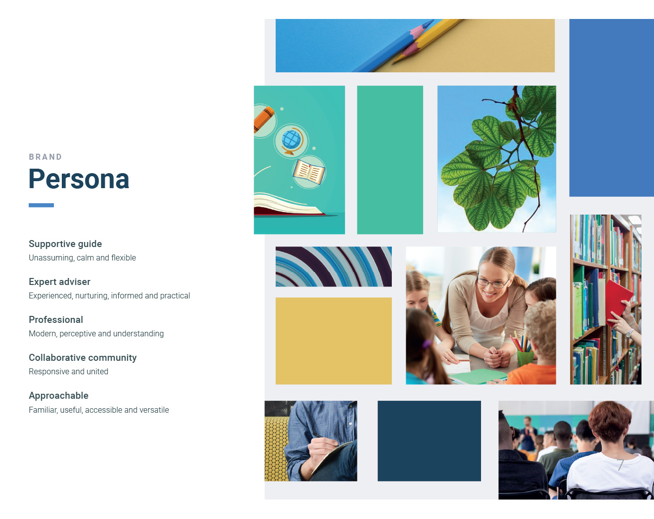
Branding
Role
Lead Designer, ESA
Stakeholder management, workshop facilitation, design, survey, reporting
Duration: 1 month
Team
1 Lead Designer
1 Designer
1 Business Analyst
Project
Online Formative Assessment Initiative
Client: Department of Education
Users: Teachers, school leaders, students and parents
Background
As part of the design phase for the Online Formative Assessment Initiative, ESA (Education Services Australia) were tasked with creating a brand for the on-demand assessment tool being designed. As we were also the team designing the tool, the task was assigned to a smaller part of the team, including myself as the lead designer.
My role as lead designer was to plan and facilitate workshops and surveys and lead brand design and innovation by creating and validating outputs, including the name, logo and branding guide.
Branding workshop
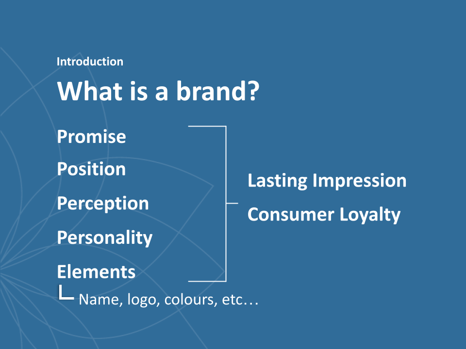
Every branding project kicks off with a branding workshop organised with key stakeholders. This allows the team to empathise with each other, the target audience and products, and define the five components of a brand (our almost 5 Ps):
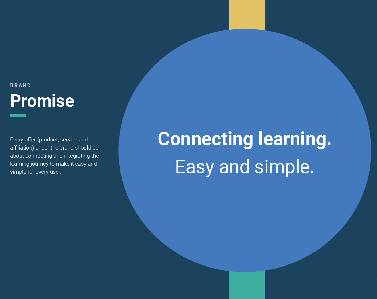
Promise: The value/experience a user should expect every time they interact with any tools under the brand
Positioning: The people the brand needs to talk to, including the target audience and influencers
Perception: How the brand wants to be perceived by our target audience
Persona: How the brand will present ourselves
Elements: The physical attributes of the brand which represent the other components. An example of a brand element is the logo.
To start teasing out these components, I planned a few different activities. Each activity was designed to engage with the way different stakeholders think and find the brand that matches the why, how and what of the project. I worked with another UI Designer and Business Analyst to facilitate group activities within the workshop and ensure every one had the opportunity to contribute. To create an environment for brainstorming, we posted the slides and artefacts from discovery on all walls in the room, and set up a slide deck to introduce each activity.
Introduction to branding
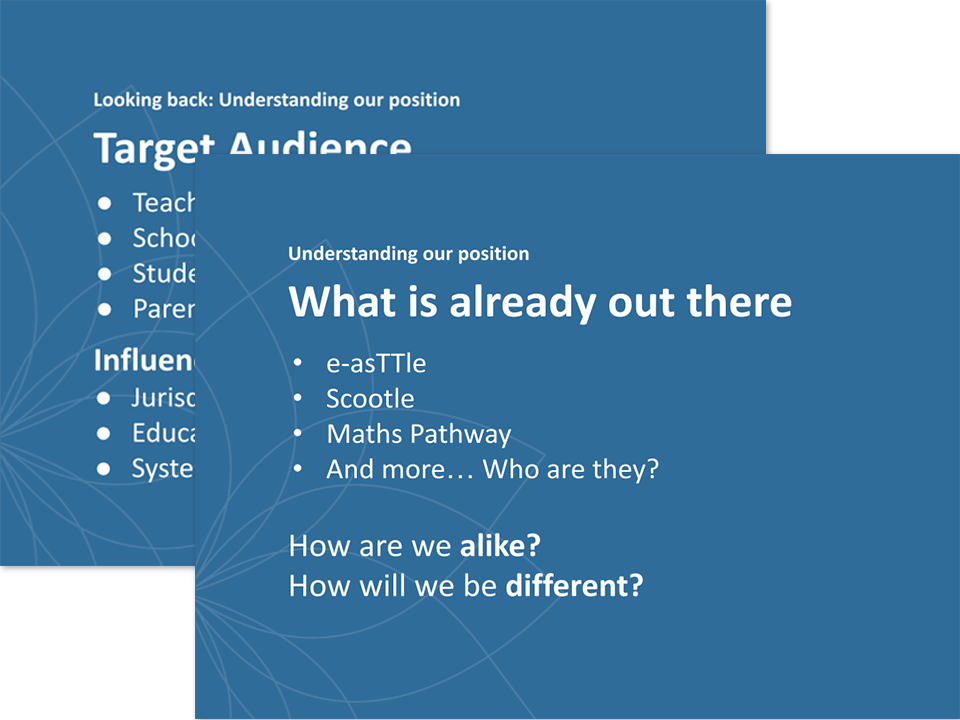
Looking back at our research
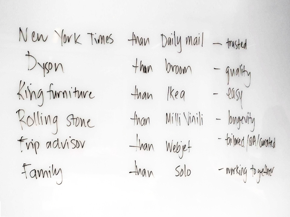
More like ... than ...
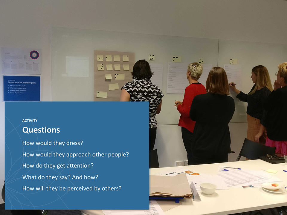
Brand as a person
Naming workshop
The most important element that would represent a brand would have to be the name. However, it probably ranks as one of the most challenging tasks a new brand would have to accomplish as it is the critical first impression, and it needs to be memorable in order for customers to come back for more.
The project owners came to me to request support in naming the eventual tool, hence I recommended and organised a naming workshop - allowing us to collaboratively generate and evaluate potential names in a short space of time. I led a team including a UI Designer and Business Analyst to help the project owners name the tool being designed via a few workshop activities. To keep in mind the branding activities, the naming workshop was held straight after the branding workshop.
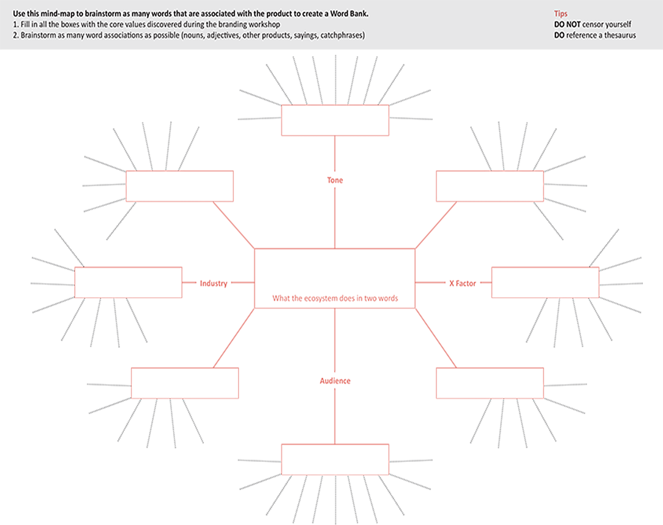
Word Bank to generate words based on the core values through affinity mapping
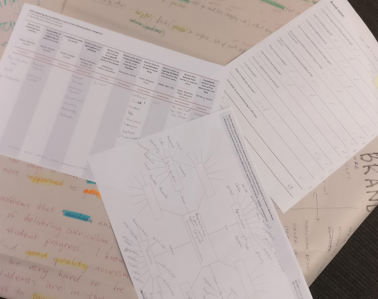
Fill in name categories to use the word bank to play with words in different ways
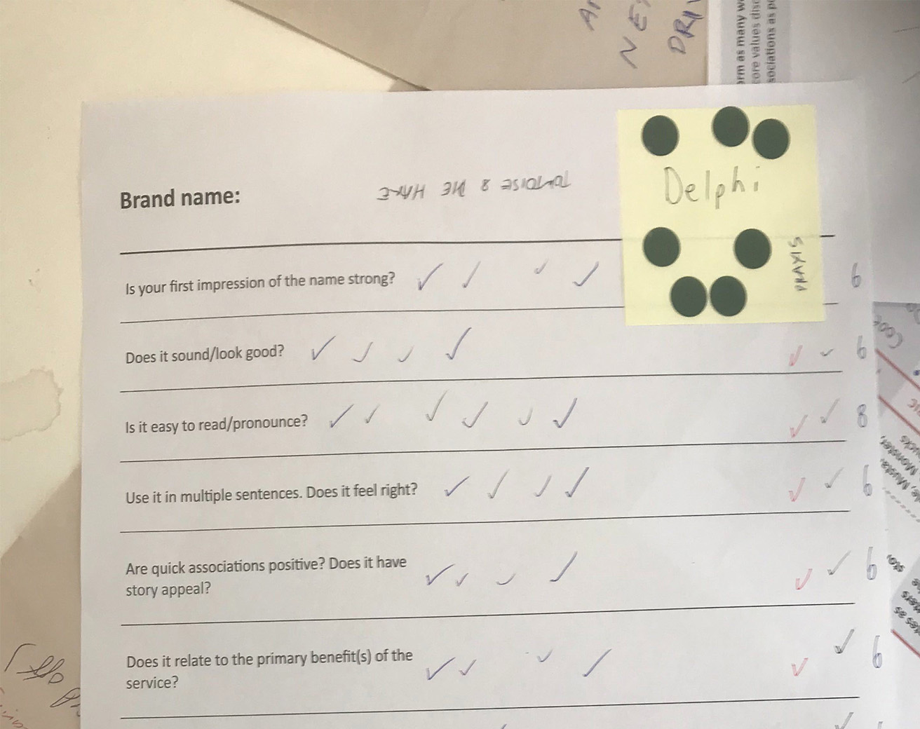
Evaluation to prioritise which name they liked, and the style of names they preferred
Branding canvas
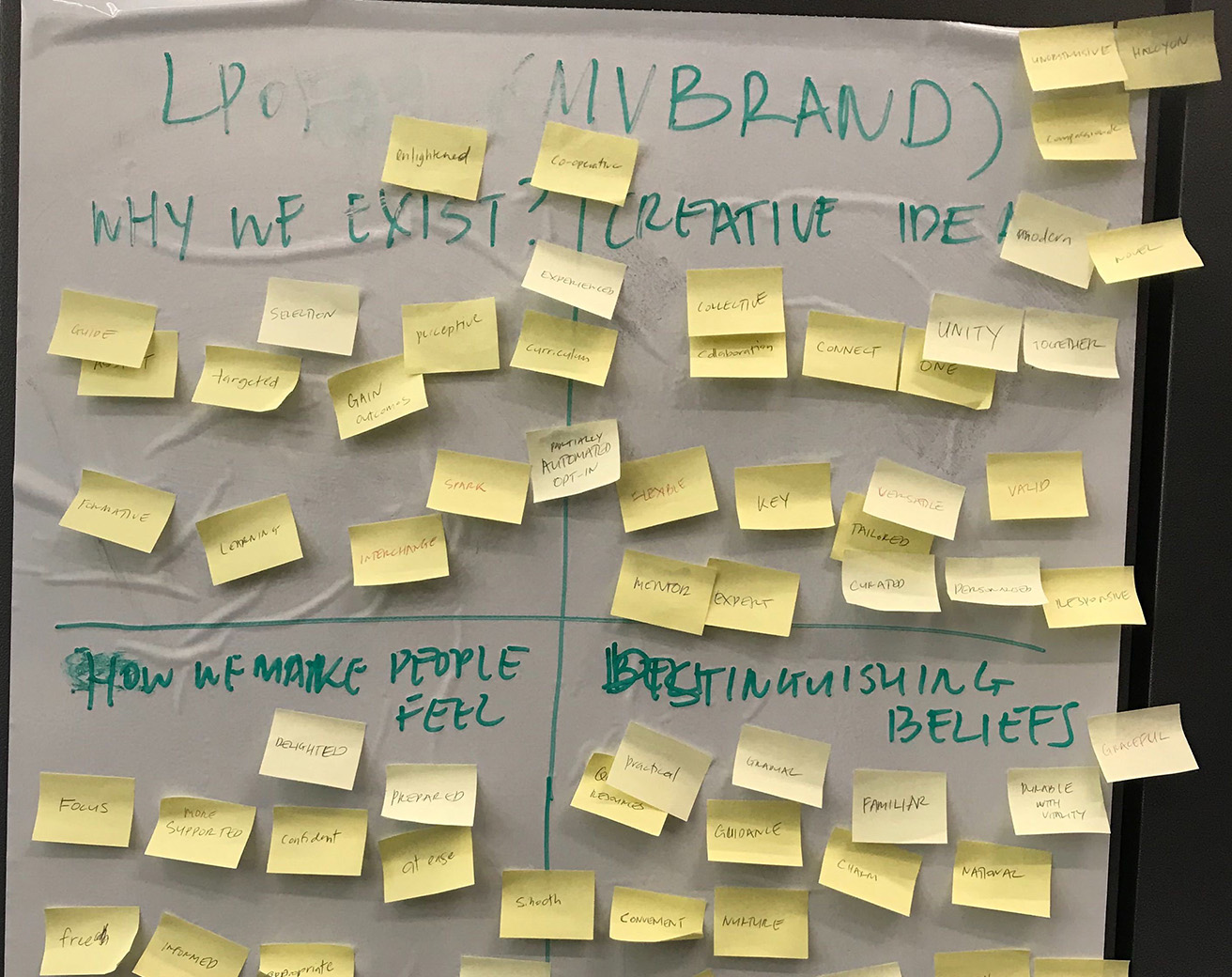
I analysed the outputs of the two workshops by doing some card sorting of common words that came out relating to adjectives and verbs. This would become the core values of the brand - how it was to be perceived, and how it would be presented. To help expand on these to produce a complete brand story, and inform the look and feel (and name) of the brand, I used a lean branding canvas in combination with colour theory and familiar brand archetypes. Accessibility was also kept top of our mind with selection of colours and symbols.
The final outputs were presented to the project owners as the brand promise, positioning, perception and persona.
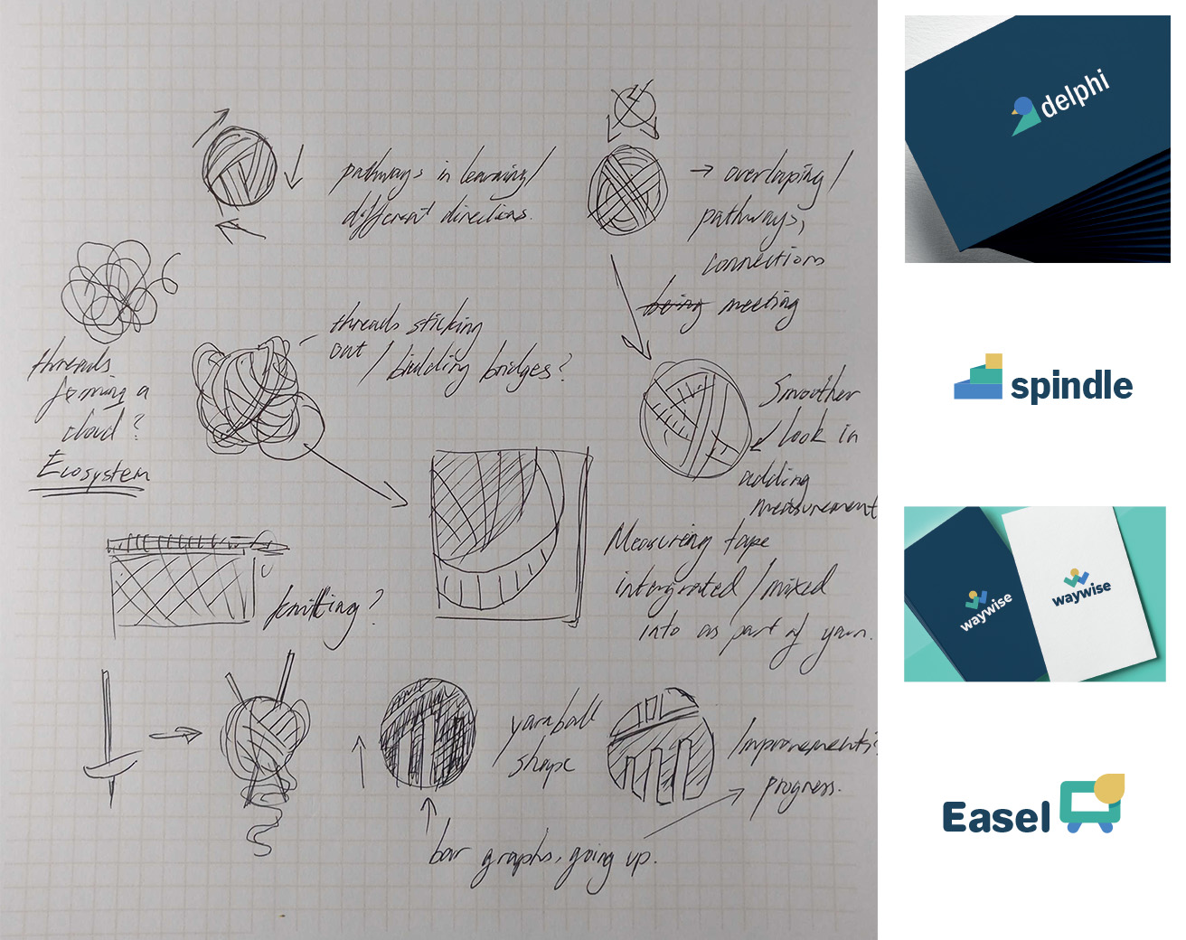
Initial ideation on paper, and first four logos presented to client
Logos and naming
Next up was the design of a new logo, as well as the new name. The main input to start off this process was the branding canvas of course, as well as the names produced from the naming workshop.
I worked with the UI designer to expand on the values we have uncovered to create names and logos. As we knew the tool to be "on-demand", we imagined it would be a prefix to multiple services, and added that as a requirement in our ideation. During the two week period where I was designing a logo and name, I left a whiteboard with our branding canvas and word associations, as well as our names list, up for the rest of the tem and organisation to see, inviting them to have a look and put forward any ideas they have.
At the end, we had five names and logos to present to the product owners, each including their unique stories.
Evaluating with the target users
The product owners asked for another test of the final name - they wanted the decision to be owned by the target users. I presented the logos and their stories. The presentation allowed us to gauge first impressions, which were mostly favourable, however there was a clear favourite.
To allow users to sit on their impression a little longer, they were asked to fill out a quick survey which allowed them to select which logo they liked, as well as rate the logos on a scale of how they felt it matched the core values via semantic differential scales to evaluate brand perception.
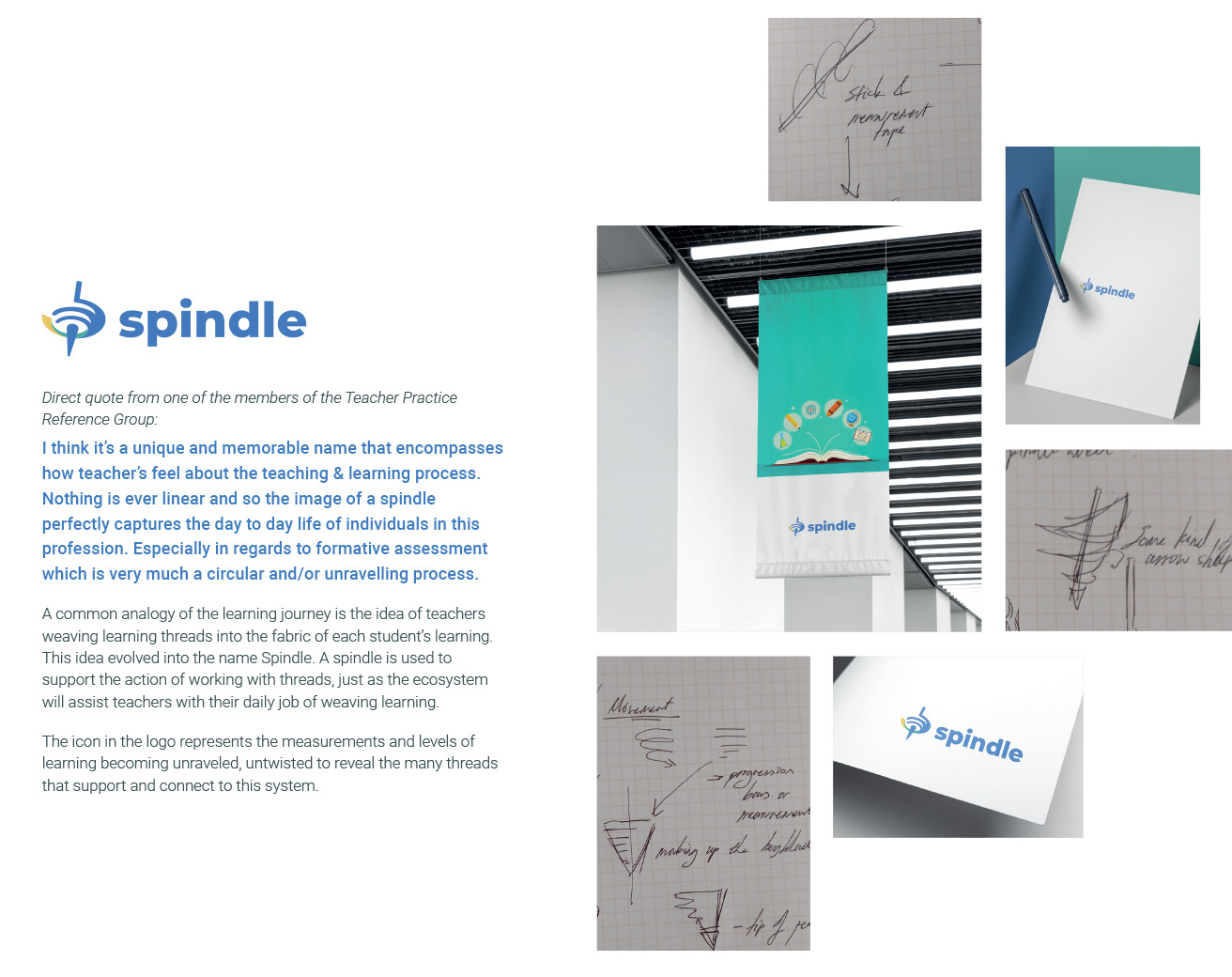
The favourite from the first impressions was still a favourite in the survey: Spindle.
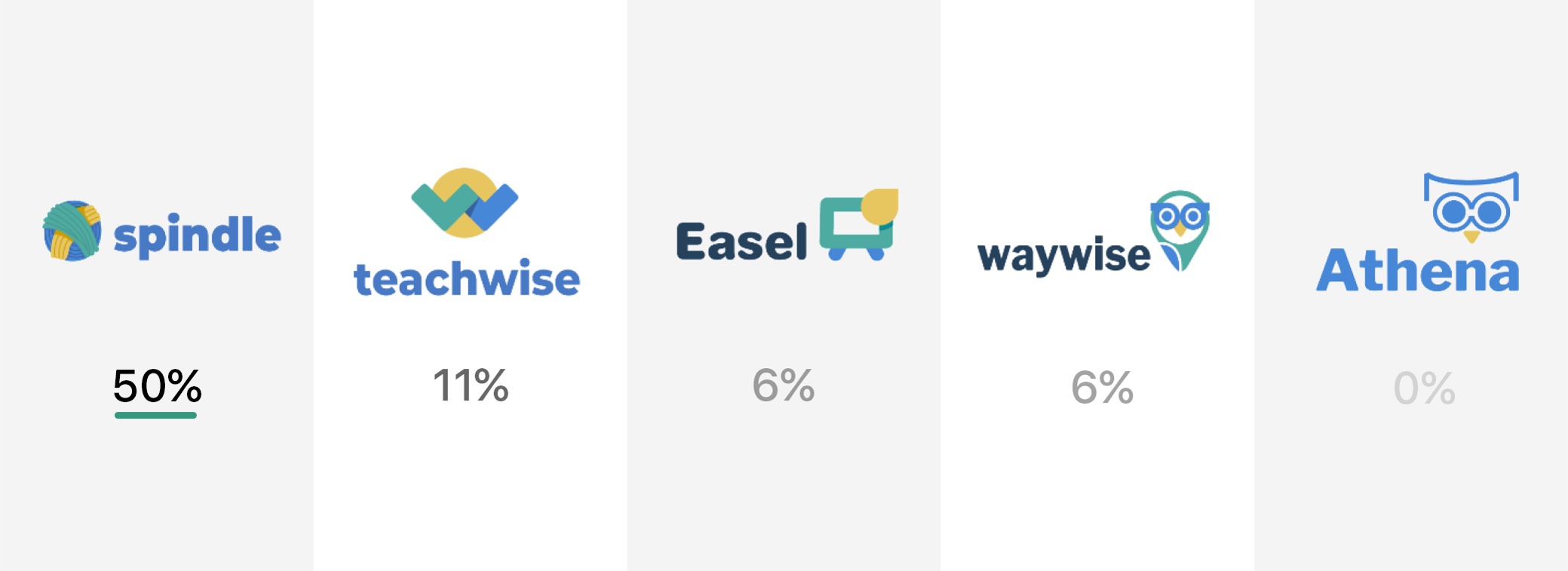
Results of the branding survey based on personal preference and perception of alignment to core values
Branding guide
After a few more iterations, the final output of these exercises was the branding guide and Spindle logo. However it does not end here. The branding guide was used to inform the design of the tool, including a style guide and pattern library, together making up a design system ready for an assessment tool, and ecosystem.
Lessons learned
This was overall a successful branding exercise, it was eventually used in the prototype, and handed over for usage in future projects within Online Formative Assessment Initiative. Other members of the projects used the branding guide to help inform designs of videos and messaging of content.
The naming workshop was especially difficult, and asked a lot of the participants, as the branding and naming workshop ran the whole day, so five hours of workshops, as it was hard to get everyone in the same state at the same time. I would prefer to split it into two days so participants can have time to digest the branding workshop and have the help of some of our analysis before going into naming.